Color is everywhere. It shapes our moods, guides our eyes, and helps us make decisions — often without us even realizing it. In design, color theory is a powerful tool that allows you to create visual stories that are not only beautiful but also effective and meaningful.
Let’s explore why color theory is considered the heart of great design and how you can master it to make your creative work stand out.
At its core, color theory is a set of guidelines about how colors work together and how they impact viewers. It’s based on centuries of art and science and helps designers create color combinations that are pleasing and impactful.
It’s not just about picking "pretty" colors. It’s about choosing the right colors to communicate the right message and evoke the right emotion.
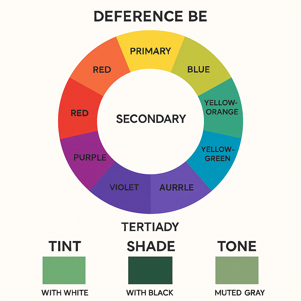
The color wheel is a fundamental tool that makes color theory easier to understand. It shows the relationships between colors and helps you quickly build a palette that works.
Primary colors (Red, Blue, Yellow): The building blocks. You can’t create these colors by mixing others.
Secondary colors (Green, Orange, Purple): Made by mixing two primary colors.
Tertiary colors: These are created by mixing a primary color with a neighboring secondary color, giving you more nuanced tones.
The color wheel can guide you in creating different types of color schemes to achieve your desired effect.
Colors directly opposite each other on the wheel (like red and green, blue and orange). These combos create strong contrast and vibrant energy, perfect for grabbing attention.
Colors next to each other (like yellow, yellow-green, and green). These combinations feel harmonious and natural, great for calming designs or nature themes.
Three colors evenly spaced on the wheel (like red, blue, and yellow). This scheme is lively but balanced — perfect for playful or creative designs.
A single color in different shades, tints, and tones. This creates an elegant, cohesive, and minimalistic feel. Often used in luxury branding and sophisticated layouts.
A main color plus the two colors adjacent to its complement. This offers contrast without being too intense — ideal for modern, balanced designs.
Colors carry meaning and can change the way we feel or think. Designers use this emotional power to influence viewers.
Red: Excitement, passion, love, or danger. Perfect for call-to-action buttons or bold statements.
Orange: Creativity, warmth, enthusiasm. Great for playful or energetic designs.
Yellow: Happiness, optimism, attention-grabbing. Effective for cheerful, inviting designs.
Green: Growth, health, tranquility, and nature. Popular for eco-friendly brands and wellness projects.
Blue: Trust, calmness, professionalism. Common in corporate and tech branding.
Purple: Luxury, mystery, creativity. Often used for beauty, fashion, and premium products.
Black: Power, sophistication, elegance. A timeless choice for luxury and high-end designs.
White: Simplicity, purity, cleanliness. Essential for minimalist and modern aesthetics.

Coca-Cola uses red to create energy and excitement and to stand out on crowded shelves.
Starbucks uses green to suggest freshness, growth, and a relaxing environment.
Tech companies like Facebook and Twitter choose blue to convey trustworthiness and professionalism.
These choices aren’t accidental — they are rooted in color theory and psychology.
Start with your message. What do you want people to feel or do?
Limit your palette. Too many colors can overwhelm; focus on 2–3 main colors plus neutrals.
Check contrast. Especially for text, make sure your colors are easy to read and accessible.
Test on different screens. Colors can shift between devices and lighting conditions.
Use online tools. Websites like Adobe Color or Coolors can help you create balanced palettes quickly.
Good design isn’t just about looking pretty — it’s about communication. Color theory helps you guide the viewer’s eyes, set the right mood, and reinforce your brand or message.
When you understand and apply color theory, you can create designs that are not only visually stunning but also purposeful and effective.
Ready to put theory into practice? Try creating a few sample designs using different color schemes and see how each one feels. Notice how small changes in color can dramatically shift the vibe of your design.